Design proposal for Rappi, specifically on how to design the user profile.
Rappi proposal
Introduction.
The objective of this case study is to improve the UX by addressing the design guidelines and the mental models that they generate in users. I also deal with the amount of information that should be shown to the user, the importance of flows and finally some details about iconography.
Rol e
Product Designer
Date
December 26, 2020
Category
Proposals
TAGS
Mobile App, Product Designer, User Experience
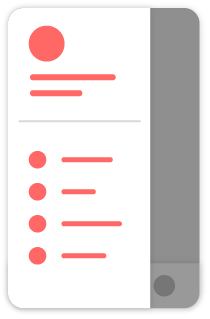
Current design
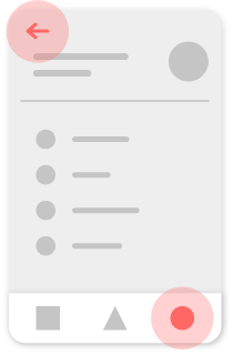
Proposal
Explanation.
Design guidelines
Design guidelines create
mental models
in users, so it is advisable to follow them whenever possible. In this case there are 2 elements that have their well-defined guidelines.
Therefore in the current design we have a small problem, since a side menu is opening when touching a tab of the bottom navigation menu.
Side menu
The side menu is always opened via a navigation menu icon in the top bar of the application. A "burger menu" is normally used for this.
I think the widget that tells the user what level of the Rewards program they are at could display some relevant information, such as how far along they are in reaching the next level and how much time they have left.
In the end one of the problems in mobile UX is excessive screen flows to reach the desired information/task.
By adding this information, in addition to improving the user experience, since we will avoid many screen flows when they want to see their progress, we will manage to give the Rewards program more attention for the following reasons:
Diseño actual
Propuesta
Progress
In any long-term goal it is a good practice to show the user the subtasks they have already achieved to keep them motivated, in this case, the points they have earned.
Time factor
Showing the time available to achieve a goal has a psychological factor that makes people tend to give it more priority than if they were unaware of such information.
Better flows
By designing the correct tab behavior, we can create depth in the flows without losing bottom navigation.
Que el usuario se sienta cómodo navegando por la aplicación es uno de los puntos críticos del mobile UX.
Knowing that the user's thumb is going to be very close to the bottom navigation, it is interesting to take into account
Fitts Law
offering the possibility to return to the top-level screen by tapping on the 'My profile' tab.
Iconography
One of the functions of the icons is to facilitate the scanning process that users perform when searching for something in the interface.
With this in mind, it is very important to set a unique icon for each option, as currently the 'Profile Data' and 'Order History' options share the same icon.
Extra: In addition, in this case we can add a branding detail to the icon to make it unique and Rappi's own.
Current icons
Proposal
Takeaway.
Design guidelines generate, over time, mental models in users, so it is very important to follow them whenever possible, because if we do not, we will be generating a cognitive friction to our users that will lead to a bad experience.
Another very important point is navigation, which is very important in Mobile UX. By creating a correct information architecture and creating good screen flows, we will achieve an excellent navigability.
Finally comment that Rappi is a really well designed product and that this is my solution, but not the only one!
Translated with www.DeepL.com/Translator (free version)