I started this venture by launching an MVP to the market in 2015. The product iterated until 2020 becoming the largest freestyle platform in the world.
Roostfy.
Introduction.
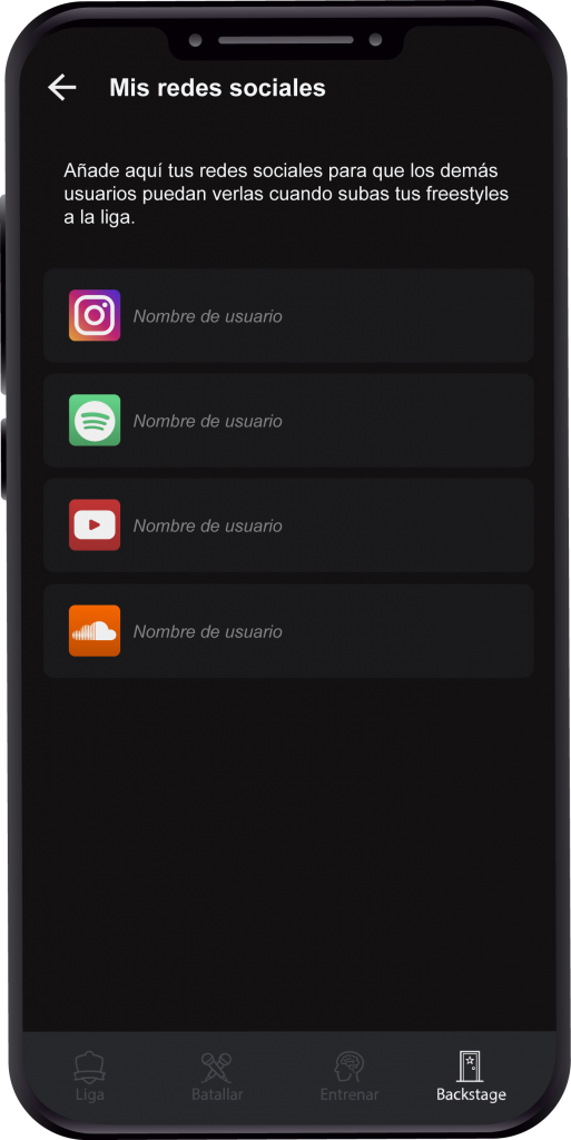
Roostfy is currently the largest freestyle platform in the world. It has more than 3 million downloads in Google Play
in more than 80 countries, and a 4-star rating with more than 9,000 reviews.
Role
Head of design
Date
July 1, 2015
Category
Product Design
TAGS
Entrepreneurship
Value proposition.
When we developed Roostfy in 2015, we were filling a great need presented by the entire freestyle community. At that time there was only the official Red Bull App, but users were not satisfied with the product and kept asking for features and improvements.
Our platform entered the market in 2015 as an MVP and currently, after 5 years and many iterations, it covers all the needs of users, such as training, competing online, live battles, etc.
Research.
Field study
In this phase of the research is where I empathize with the user and begin to understand their needs. In this field study I use a sample of 15 users and use two methods to collect the information: direct observation and qualitative interviews.
Direct observation I do it in their natural environment (in parks, in squares and at home) to understand how is the real process of the user during their tasks.
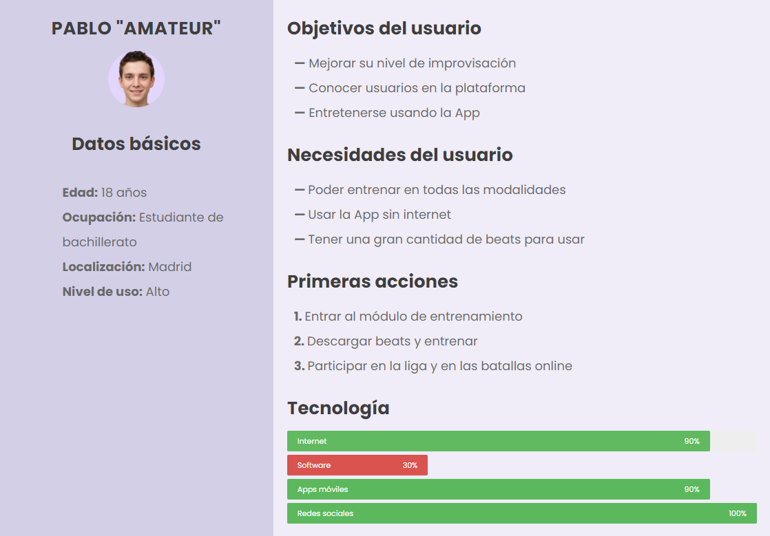
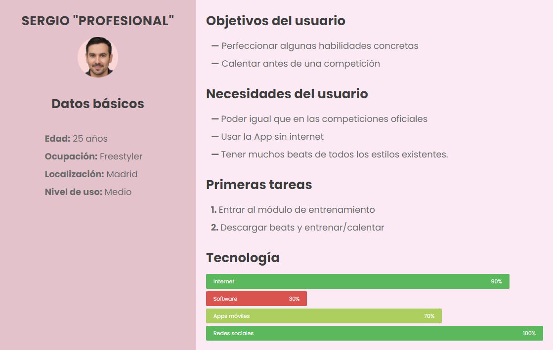
The output I get from this phase are the two main
Personas
who use my product.
In the App there are certain functionalities that require a continuous use by the user in order to correctly analyze its usability, therefore I decide to use this method to test those functionalities.
For this study I have 10 users, who have to fill in a document daily during the use of the App with the following information:
Tasks performed
Feelings
Goals
Frustrations
Usability testing
For the usability testing I recruited 10 users, following the good practice of testing with 5 users from each segment defined in the field study and interviews.
The usability test plan consists of 10 tasks, objectives, location, business case, etc..
You can see it in detail by tapping the button below.
In the mobile app market there is only one competitor: Redbull.
My analysis starts by downloading the App and reviewing all its functionalities and how they cover them from the user's point of view.
The next thing I do is analyze all the reviews (positive and negative) on Google Play to find out the desirability of the users and what their biggest frustrations are.
The App is always very slow, and has very few options when you upload your posts, you can't delete or edit them. Also there are few beats and sometimes they don't sound.
Aaron
The idea is great but it lacks many things to improve. The beat most of the time does not sound, the App is very slow, and the validations to register fail constantly.
Jeff
Please add online battles!! That's what all of us users are asking for, to be able to battle face to face with other users!!
Carlos
Day
A (current)
B (redesign)
1.
8
15
2.
7
16
3.
10
22
4.
9
16
5.
11
20
A/B testing
Since I launched the
MVP
many of the iterations were validated through this type of testing.
The standard methodology is to test the new design with about 10,000 users to see what impact it has relative to the control group.
In this example, the average daily usage of a new functionality is measured by cross-referencing the data from group A with that of group B.
The experiment had a 98% increase in the average usage of the redesigned functionality, which was a great success.
Design decisions.
"Even professional league websites are hard to understand [...] I have a hard time finding the information I want."
Javier S. (Tester)
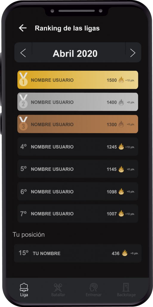
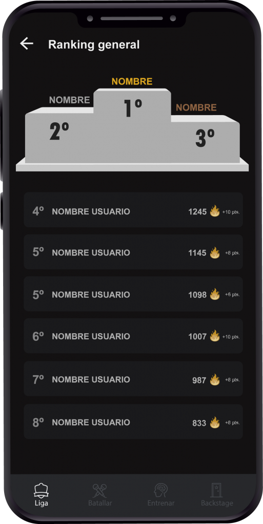
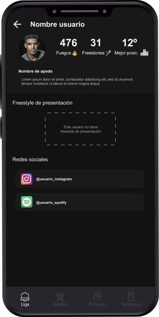
Online league
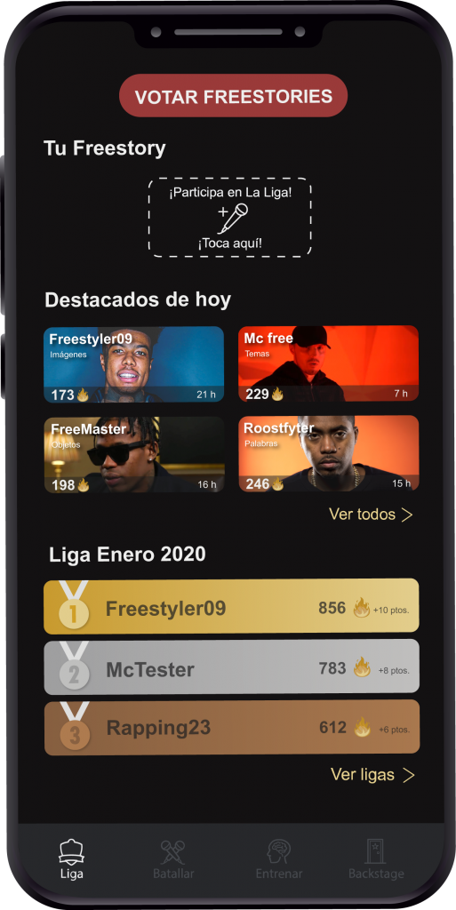
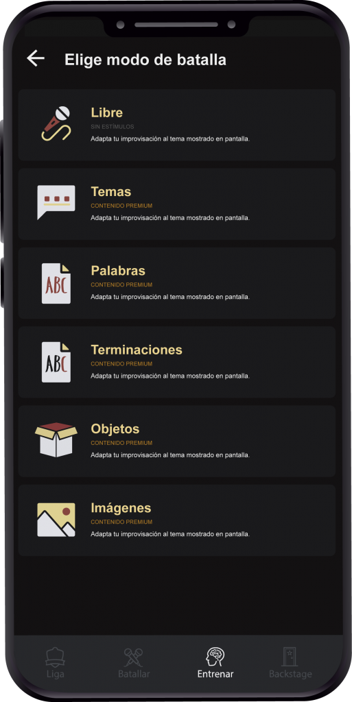
The first difficulty comes with one of the most complex functionalities of the App: competing for an online league every month.
The challenge here was to get a correct distribution of information and functionalities on the screen, from what I could perceive in the interviews with users.
Several testers said the same, so the goal was to show five functional blocks of the league on a single screen, while maintaining a good user experience.
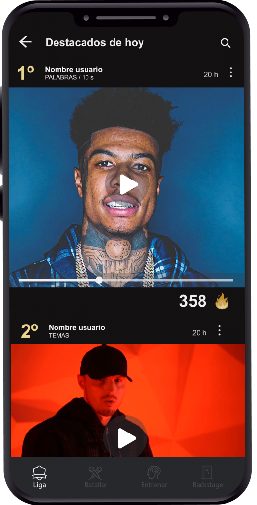
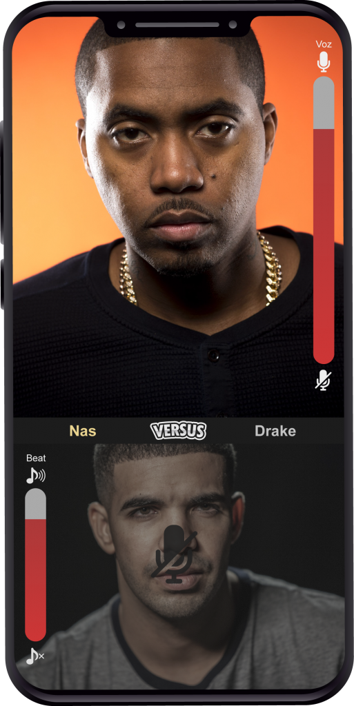
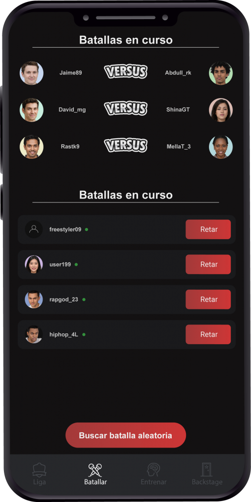
Live battles
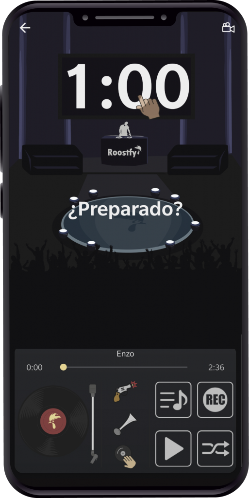
The second difficulty came with the App's most powerful functionality: live battles between users.
These battles take place in turns of 60 seconds.
While developing the user tests I saw certain problems that needed to be solved to achieve a perfect user experience, so I decided to implement certain visual and functional details on the screen.
"During the battle it is not clear to me whose turn it is."
David R. (Tester)
"Sometimes my opponent's microphone makes a lot of noise when it's my turn."
Bautista Q. (Tester)
Problem
Solution
Opponent noise during your turn.
Programmatically mute the user who does not have the turn.
Inadequate volume of the opponent's voice.
Volume controller in the area of the opponent's layout.
Inadequate volume of your music.
Volume controller in your area of the layout.
Not knowing whose turn it is.
Increase the screen size of the person who has the turn and slightly darken the camera of the other.
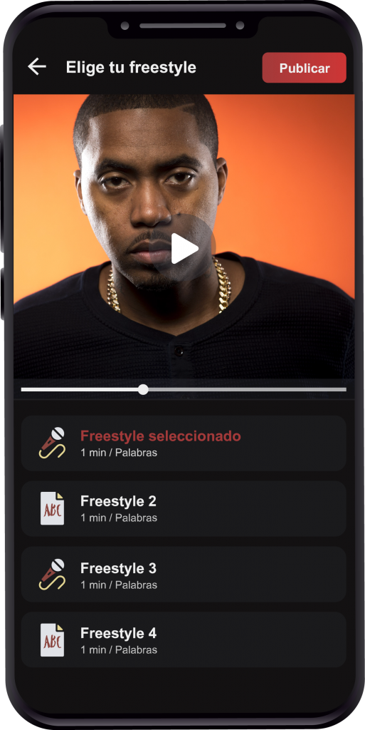
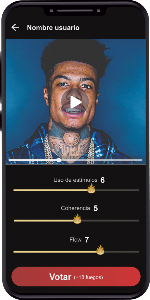
Voting method
The way to vote for other participants is based on 3 parameters, each with a score from 0 to 10.
In a first version, the value of these parameters was entered manually by the numeric keypad of the mobile, but with the data collected in the daily study I realize that the time and effort of the task are causing users not to perform it.
Therefore to improve the experience of this task I decide to replace the 3 inputs with 3 sliders.
This design decision is validated by the results of the A/B test described above.
Information architecture
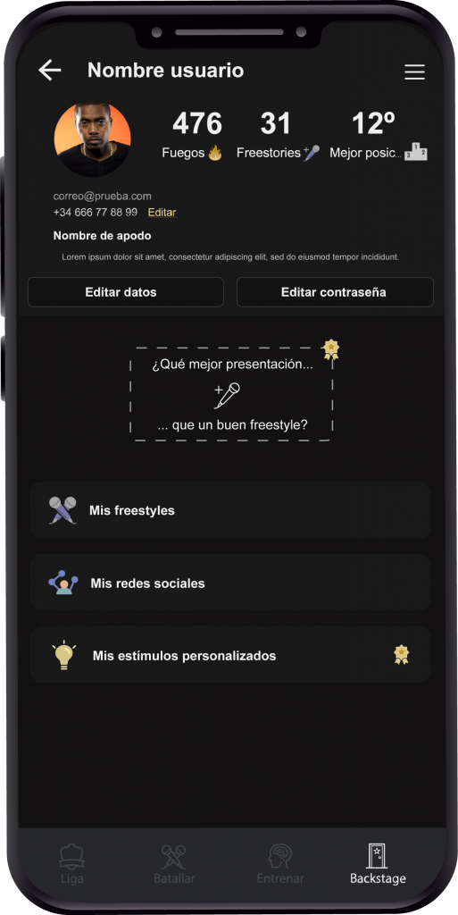
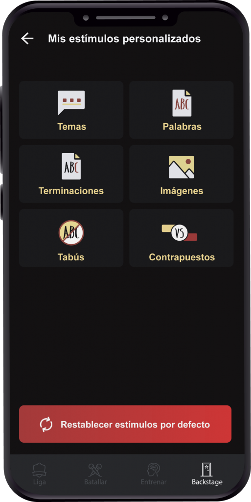
Roostfy became a platform similar to a social network, so the information architecture increased in size and complexity.
At this point I decided to implement a four-tabbed navigation menu that would be responsible for encapsulating the four functional blocks of the platform.
Design system.
Colors
The primary color is a low saturated red to avoid excessive contrast on the black background.
The secondary color follows the same concept as the red, but in this case in the yellow range. Its purpose is to take care of secondary actions.
Components
This is a crucial point to save future labor and gain consistency throughout the product.
The whole interface is studied following the laws of Gestalt psychology to ensure a correct visual perception by the users.
Typography
In this product I decided to use Android's default font: Roboto.
It brings me the typographic cleanliness I need on the screens, since the reading is white on black.
Graphics
All graphics, both illustrations and color icons, carry a flat design to bring cleanliness to the interface.
Colored icons are used in areas where more visual information is required than that provided by a black/white icon.
Line icons are used in areas such as the side menu, bottom tabs, top menu, etc.
Animations follow the same visual pattern as the graphics, and are used at certain points in the App where some dynamism is required.
The illustrations are created in Adobe Illustrator and the animation process in Adobe After Effects.


