Design proposal for the Cabify app, specifically on how to integrate Movo into the product.
Cabify X Movo
introduction.
This design proposal tries to improve the UX taking into account the user's mental model and a clear separation of functionalities. In this way we achieve a design focused on tasks that the user will appreciate when using the application.
Role
Product Designer
Date
November 3, 2020
Category
Proposals
TAGS
Mobile App, Product Design, User Experience
Current design
Proposal
Explanation.
Mental model
When icons are displayed on a map , the user expects that touching them will produce an event that has to do with said map (center your position, center north, show extra information, search for an address...).
This is the
mental model
that has developed over time in users due to the use of applications such as Google Maps, Maps, Waze...
And the problem with Cabify's map is that something very different happens:
1. A new screen is opened.
2. The tabs are lost.
3. Another map is loaded.
4. The side menu is lost.
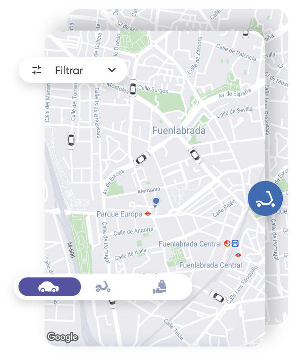
Functional division
There are two clearly differentiated objectives in Cabify: mobility and delivery.
The problem is that, within the functional block of mobility, the two possibilities that exist (being picked up by a Cabify or moving yourself with a Movo) are "united but separate", I mean, they are united because the option to look for a Movo is on the map in the Travel tab, but separate because touching the map option opens a new screen and loads a new map with Movo scooters.
I think we need to rethink the information architecture and separate them completely in the interface. Getting stuck in the middle can be confusing for the user and worsen usability.
"I want a cabify..."
"I want to move..."
"I want to send..."
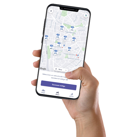
Information architecture
By clearly separating the three functionalities in the interface, the result is a clearer and more accessible information architecture, since we never lose access to the tabs or the side menu, and visually the user he knows at all times what his possibilities are.
In addition, we decrease the depth of the screen flow by one level , thus achieving a positive impact on usability.
That the user feels comfortable navigating through the application is one of the critical points of mobile UX.
current
Proposal
Fitts' law
Everything mentioned above positively affects the usability of the product, but we can add an important detail:
Fitts' law
By positioning the filter widget at the bottom, we make it much more accessible for users who are using the mobile phone with one hand (out of habit or necessity).
Takeaway.
Many times in design changes you have to pay attention to small details, but these are the ones that differentiate a good product from an excellent one.
It is necessary to clarify that I have developed this design proposal focusing exclusively on the user experience . It is possible that due to product requirements or technical limitations of the integration itself, some things cannot be done as I have proposed.
Also comment that Cabify has an outstanding user experience in my opinion, both in usability and desirability.