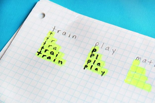
The Grid System has been helping artists of all kinds (including writers) for a long time. First used by a 13th century artist, who fused it with the golden ratio, the grid system has been a super tried and trusted methodology for centuries.
● In writing it allowed writers to place their handwriting neatly on paper; later, it became a universal standard in the publishing industry.
● In painting it helped artists achieve better results and maintain greater consistency in their pieces.
● In cartography, it was also essential to use the grid system to achieve the necessary accuracy in maps.
Writing
Painting
Cartography
And we currently use it in product design to take advantage of that whole set of benefits, among others.
Okay, but... Here we've come to answer the next question:
— "Which is better: 8pt or 10pt?"
Next we will analyze the reasons why the 8pt Grid is better for product design.
1. Scales perfectly
As you may know, we design for the smallest screen size. This allows us to scale our assets to the different sizes required by the devices (@0.75 | @1 | @1.5 | @2 | @3 ...).
In the following image you can see what happens with the first 3 scalings in both Grid Systems:
2. Apple and Google recommend it
If Apple is using an 8pt grid in its Design System (Human Interface) and Google also in theirs (Material Design), for us as product designers it has a lot of importance, especially if the product we are working on is an application to be used on mobile devices.
Remember that app is going to have to run on an iOS or Android device, yes or yes! 🙂
We must clarify that this does not force us in any way to work with 8pt, but we must take into account that we are designing a product that, in the end, will run on an operating system. Therefore, if the user opens our application and finds a similar visual environment (margins, sizes, paddings, etc) we will achieve a great consistency.
3. Greater flexibility
When we get down to work and we are designing our pixel perfect, we have to work constantly with margins, paddings and sizes ... and in many cases, the size jump that allows us a grid of 5px as a basic unit does not serve us, as it is too aggressive (especially in the first measures).
● In the following image I show you how it works in 8pt:
8pt and 4pt as basic units
As you can see, that first part which I call *First measures, gives us a range of possibilities when designing, since many times we will need very small spacing between interface elements, and 5px would be excessive for these cases.
You can also see that there is a *2 there, and maybe you think it should not be there, but it is precisely for these specific cases where we can use it exceptionally and it will come in handy when making the most of the screen space is our priority.
● In the following image you can see how it works in 10pt, and so you will see better the difference:
Translated with www.DeepL.com/Translator (free version)
10pt and 5pt as basic units
As you will see, here the flexibility is much less, since the jumps will be at least 5px and this in many elements of the interface will be excessive when we are designing.
I hope you found the article useful.
See you in the next one! 🙂
Mental models play an important role in Human-Computer Interaction (HCI) and Interaction Design. They relate to the way a user perceives the world around them and are based on beliefs.
Where to place your UX resources in the organization chart? Below we will see where companies usually place the UX department or person and what is usually the best way for the...
MVP? Better go for a MUP February 8th, 2020 / Design management, Product design Don’t look for an MVP, look for a MUP It is often sought to develop the Minimum Viable...