In this project I designed a new version of the Add to Cart button (ATC) for the groceries experience at Rappi.
New Add to Cart
Introduction.
This is one of the projects I led to improve the experience of our users during their purchase process. In this case I focused on improving the UX in terms of usability, analyzing the 3 most important KPI's in a delivery experience.
Role
Design Leader
Date
May 18, 2021
Category
Product Design
TAGS
Usability
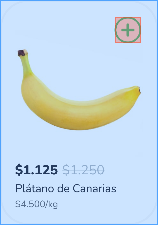
Old design
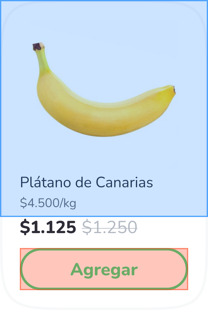
New design
UI Design.
Wrong button position
By having the button on top of the product itself, users experience a lot of missclicks during their purchase.
The product card has 2 events:
1. Open the product detail.
2. Add the product to the cart.
What is happening is that on many occasions the user is wanting to add a product to the cart, but is unintentionally touching the area that opens the product detail screen. This generates a lot of cognitive friction and becomes a serious usability problem when it is repeated several times during the purchase process, as it considerably increases the total time spent.
Product Detail events
Add to Cart events
Old design
New design
With the new location of the ATC button, we can protect and separate correctly the zones of the 2 events. This way we help the user not to commit missclicks that generate friction during the experience.
Undersized
The size of the button is too small (32px) for the importance it has in the conversion. I always recommend following the best practices for this type of buttons, which should be finger-friendly (44px) to ensure that the user touches the button without problems and not elsewhere.
It may seem a simple detail, but designing according to Fitts' law improves the UX of this action, since we optimize its effectiveness and efficiency when carrying it out.
Usability.
01
Taps / Clicks
required to complete a given task.
02
Screens / States
that you have to go through during the execution of a task.
03
Time
that must be invested to complete a task.
KPIs definition
To properly address the phase of the project where I evaluate the usability of the designs, the first thing I do is to define what are the most important KPIs in the experience I'm working on.
In this case, during an online purchase in groceries, there are 3 KPIs of extremely high importance to determine the overall user experience.
Once we have the KPIs we are going to analyze, we can move on to perform a heuristic evaluation to make a comparison between the design we are trying to improve and the new solution. In this way we can quantitatively demonstrate which of them is better in terms of usability.
Heuristic evaluation
In this heuristic evaluation we must identify the tasks in which we can measure the KPIs that we have previously defined. In this way we will be able to build graphs and comparatives between the design we want to improve and the new solution.
To better understand this, I drop below as an example a comparison of the 3 KPI's with a very recurrent task during online shopping: Modify the units of a product.
Taps / Clicks
My Skill
3
My Skill
1
Screens / States
My Skill
4
My Skill
2
Time (seconds)
My Skill
0.75
My Skill
0.25
Old design
New design
Data analysis.
Defining events
The next step is to analyze the entire experience where those indicators enter the playing field.
At this point we must find the events with which we can measure the previously mentioned KPIs, which in this case are:
01
Add units
Example: From 2 uds. → 3 uds.
02
Delete units
Example: From 4 uds. → 2 uds.
03
Remove product
Example: From 1 ud. → 0 uds.
Once we have that, all that's left is to build the Amplitude queries we need to access the data.
Massive analysis
At Rappi we have more than 50 million active users, so we have at our fingertips a huge amount of real and valuable data with which to validate our design decisions.
In this case with Amplitude and some mathematical calculations I got the following data:
All changes in product units in the last 30 days|
Modification → Delete units
Modification → Add units
Taps / Clicks
My Skill
21.6 million
My Skill
7.2 million
Screens / States
My Skill
28 million
My Skill
14 million
Time (hours)
My Skill
1,500
My Skill
500
Old design
New design
Guerrilla testing.
Test plan
To qualitatively validate this project I decided to include some guerilla tests, because despite having a great general impact, it is a design change that affects a very specific task: Adding and removing products to the cart.
The scenarios and tasks were as follows:
"You are doing your weekly shopping and you need to add different products to your cart..."
Add 3 units of Coke Zero
Add 1 unit of Coke Original
Add 2 units of Pepsi
“You realize you need some more Coke Zero...”
Add 2 more units of Coke Zero (i.e., 5 units in total)
“In the end, you don't want to buy Coke Original or Pepsi…”
Eliminates all units of Coke Original
Remove all Pepsi units
feedback #1
Ignacio, 29 (Argentina)
"
I could not easily remove
the Coke."
"I found
this design more comfortable.
"
"The button was
too small.
"
"The button is larger, which
makes it easier for me to add and remove products.
"
"The stepper opens and closes when you put the units on, and that
makes it very difficult for me.
"
"This design
is clearer to me
because the buttons are always accessible."
"
I like the design
but
I find the other one more useful.
"
feedback #2
Manuela, 26 (Argentina)
"I opened the
product detail screen by mistake.
"It's
much simpler
this way.
"
"Maybe the button
is too small.
"
"I can
clearly see how many units I have.
"
"I find it
tedious that it is at the top.
"
"I can add, I can remove...
It's clearer.
"
"I find it
much neater visually.
"
feedback #3
Paula, 25 (Brazil)
"Sometimes
I can't modify units
form the product card."
"I like it. If I did everything from the card itself
it would help me more this design.
"
I don't use the button, I usually open the product screen
because the button is too small.
"
In my case it wouldn't affect me much, but
this design is more intuitive.
"
"When I have to make a lot of modifications, I do them from the cart,
the product card is very tedious and slow.
"
feedback #4
Marina, 29 (Argentina)
"I opened the
product detail screen by mistake.
"The fact that
the buttons remain fixed
makes it
easier to use.
"
"In my opinion the button
is too small.
"
"I like that the button
is bigger.
"
"
I like this design visually
but
it's a bit tedious to use.
"
"I find this design
much more functional.
"
"With this design, the problem of
unintentionally opening
the product screen
didn't occur.
"
Takeaway.
Sometimes it happens (especially in Agile environments) that we get into a dynamic in which we only focus on continuously releasing new projects and functionalities, but we forget to follow up on the designs that have already been implemented.
This is really important, because if we don't do this, we will be creating a product with a multitude of functionalities but increasingly difficult to use or even less useful for our users.
Another very important point is that no matter how small or basic a project may seem, it can have a huge impact on the product, as you have been able to see!